

It’s actually optimized for them. The goal is to get users to spend time and see ads etc. The UI is not made for us users.
There are no ads in discord, there’s really no point to force the new UI on everyone.
Well: https://arstechnica.com/gadgets/2024/04/discord-starts-down-the-dangerous-road-of-ads-this-week/
Edit: it’s more loot box stuff… but it’s step one
Just use a 3rd party a…h, crap.
What’s bad about discord?
It’s not good, but I guess it isn’t too bad.
But I imagine they’re referring to the new mobile UI, which is a mess.
Yeah, Mobile UI
I’ve always thought their desktop UI to be trash too. It would definitely surprise me if I could use any discord feature without a struggle
Trash UI
Mozilla should be there, right in the middle.
Which software? If you are talking about Firefox. You can customize it easily as you want using Firefox-CSS.
Right. That’s how you get more users: by telling them to fix themselves your shitty UI by using CSS. Genius move.
You can use Firefox Theme made by community. Here’s my favorite one.
Much easier voting with my wallet and using a different browser altogether.
I enjoy the irony that you’re this obsessed with hating something you never paid for and then consider it voting with your wallet.
I remember you from: every other thread where you can shoehorn in your weird Mozilla hate
I tagged this user in Boost as “Mozilla hater” because hating Mozilla is their personality
Peak lemmy 👏
You’re losing ground. Only -3700 now :'(
Maybe lemmy is turning facisist?
lol yeah you are the global symbol for anti-fascism and anyone opposed is fascist.
Honestly discords UI is pretty good its just weirdly missing some features entierly.
Anyone who thinks that these three have the worst UI possible has never had to deal with a really bad UI. Try Sharepoint on for size. Or Azure. Or Jira. And there’s likely still way worse stuff than those.
Haha, you think those are bad? Try any professional tools, like CAD’s, DAW’s, or 3d modelling software.
Or, even worse, any internal corporate software, the bigger and the older the company is, the better… at being the worst, that is.
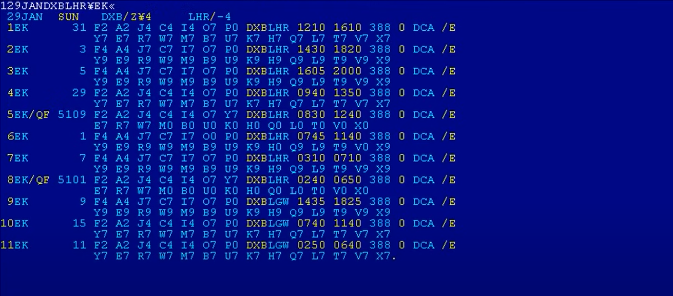
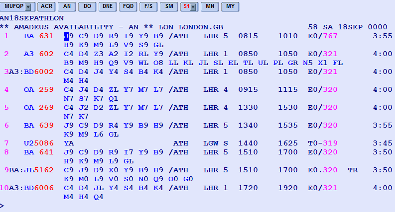
Or. actually, just go to an any airline’s office to buy a ticket and witness the atrocity they have on their monitors. No, those are not blue screens of death. That bunch of gibberish is the actual UI. And the only way to interact with it is by typing in commands that read like something that Lovecraftian creatures would sound like.
The UI of Youtube is actually not bad. What is bad is how the search function has gone to shit, constant promotion of youtube Shorts taking up half the screen, and the algorithm getting steadily worse at recommending videos.
The interface itself is pretty easy to navigate.

